Component CSS naming conventions
The BEM naming convention for CSS is widely used and has been around for a long time. But it is pre web component and there are new CSS naming conventions to fit in with web components.
The Block is now the Component
The B in BEM stands for block because each HTML container statement is said to create a block in the viewport. The HTML container statements like div don’t tell you what the container is being used for. The CSS class names like mainmenu, sidebar, infomodal etc lets us know what the div block is used for.
The BEM naming convention would have us create a CSS class=”pageloading” for the PageLoading component. By convention names were restricted to lower case to avoid case errors. Pageloading is not PageLoading.
Component based CSS naming conventions like SUIT calls for each component to have a CSS class name that is the same as the component. These class names have upper case letters.
We have a base component class named SuitComponentBase, that defines a Class parameter. Creating a base class that accepts parameters for class, style and attributes is very common. You add the values of the parameters to statements during rendering.
Base Components
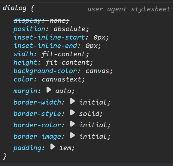
When an HTML statement is rendered, it first inherits style properties from the parent and then has styles set by the user agent. The images on the right show the user agent style settings for div and dialog. As you can see in the images the color and background properties are assigned values by the user agent for the dialog statement but not for the div. That is why the div inherits colors and dialog does not.
When the user agent sets colors for an HTML container statement, instead of inheriting them, it will usually have a border and set the colors to black and white. When I create a new base component, I do the same thing. The base class should be a functioning markup without Styling.
The CSS in the components (.razor.css) file is “isolated”, meaning it is locked down and can’t be modified by a setting in an external CSS file. When you create your components, you decide which items you want to isolate. If you want to be able to style the component, you need to place the parameters in an external CSS file.
For our base classes that are in a shared assembly, we have a wwwroot/components.css file. The file needs to be loaded at the start of the CSS cascade before the Bootstap CSS. CSS for the components created for the app are loaded after the Bootstrap.
Modifier is still modifier
The M in BEM stands for modifier. The purpose of a modifier class is to modify some style properties. There are two kinds of modifier classes the global and the component.
Global Modifiers
A global CSS modifier class has all lower case letters in its name. You could have a class named red-black that sets the background to red and the color to black. If you place this modifier on the dialog statement it would go from black and white to red and black. The dialog black and white is set by the user agent before our CSS cascade. But it will only work on our component’s default settings if the component class default filters are loaded before the modifiers. These component default settings need to be loaded at the start of the CSS cascade.
I created a component named NavFlexMenu in my shared assembly named Jmh.Blazor.Components. In the sample app, main menu, I replaced the <nav class=”nav”> statement. The nav CSS class created a flex container to hold the navigation menu. The NavFlexComponent CSS class does the same.
In the NavFlexMenu CSS class I set the flex-direction to column. If you wanted to change the flex direction to row, then you could use the Bootstrap flex-row modifier class. The statement for the component could be:
<NavFlexMenu Class=”flex-row”>
The output during rendering would be:
<nav class=”NavFlexMenu flex-row>
But this will only work if the NavFlexMenu CSS filter is loaded before the Bootstrap flex-row modifier. The Components.css file in the share library needs to be loaded before bootstrap. Bootstrap is loaded before the app.css so its modifiers do not override apps.css.
Component tied (Parent-Child) Modifiers
Lets suppose you have a component named “MainMenu” and it contains components named “NavItem”. You want to create a class to override the size and color defaults in NavItem for the main menu. The name of the class should be MainMenu—NavItem.
If the SuitComponentBase class finds a double dash in the class list, it will automatically add the names of the parent component and the receiving component. If the NavItem in MainMenu has a class parameter of — it will automatically be expanded to
MainMenu—NavItem
If there is a name following the double dash, it will be added to the end. So —color would become:
MainMenu—NavItem-color

